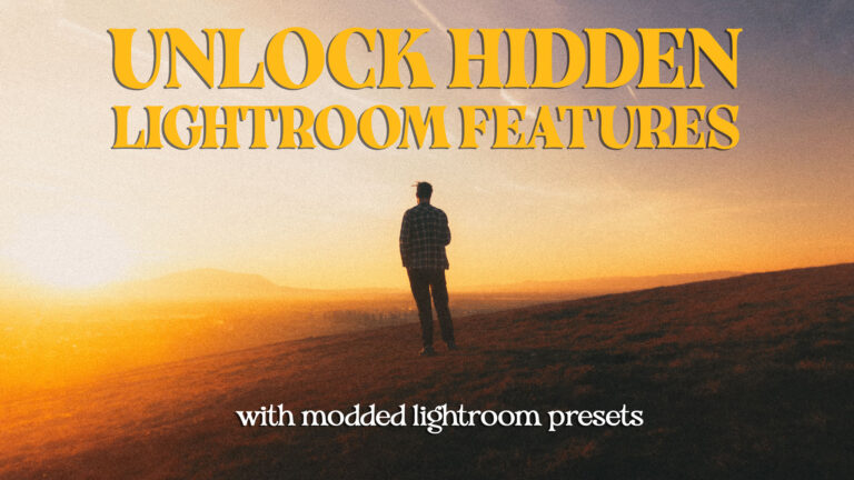
If you’ve ever watched one of my tutorials, you know I’m obsessed with finding ways to edit faster in Lightroom. I want to avoid having to jump to Photoshop just for minor tweaks or small retouching tasks, so I keep looking for ways to apply the same techniques inside Lightroom.
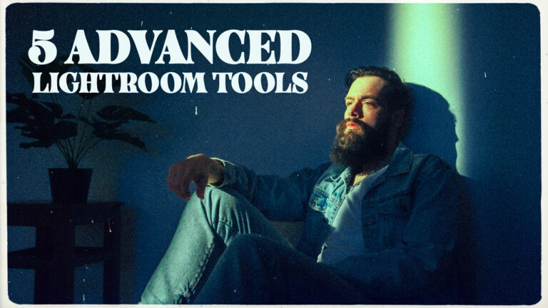
Today, I want to share 5 custom Lightroom preset tools that I created as a way to experiment, and now I can’t imagine working without them. These aren’t your average presets that just provide you with a pre-baked look. They’re more like editing power-ups for your Lightroom editing workflow that will help you get some extra features from this old software. The best part? You can make them yourself after watching my video (or grab them from my preset store – https://vmoldo.gumroad.com/ if you’d rather skip the tinkering part).
📹 Prefer video instead of text?
I do, especially when compared to reading a long article. But keep in mind that the article is a bit more detailed.
1. Lightroom Visual Helper
(Timestamp: 00:20 in video)
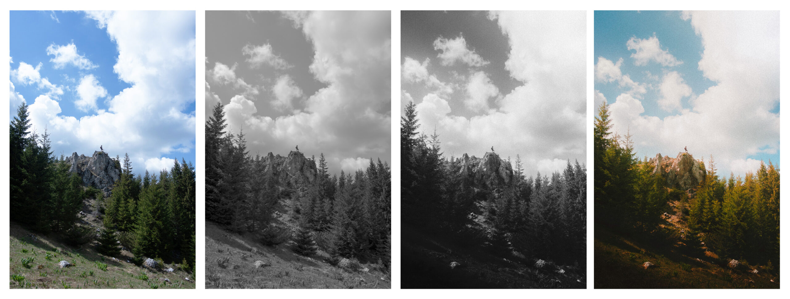
While learning retouching years ago, we were taught that turning a color photo black and white has several benefits, since color influences how we perceive brightness. For example, yellow generally feels brighter than blue, even when both colors have the same brightness value, so your eyes might be easily deceived. Moreover, in black and white, you can spot skin imperfections and small distractions easily, helping you with he spot healing / cloning.

The Lightroom Visual Helper enables you to look at your photos in black and white while editing so you can adjust their brightness and contrast values without being influenced by the colors. This helps you balance exposure properly, and your final edits will look so much better.
Just keep in mind that the Visual Helper will only enhance your editing experience and give you a better overview of the tone in your images. Afterwards, it’s up to you. I recommend that you first set a proper White Balance and basic tone adjustments to your RAW files for a neutral starting point, and then use the Lightroom Visual Helper so you can apply local area masks to enhance the contrast, exposure, and composition of your images. These masks should mainly use the curves adjustments and the exposure and contrast sliders.
The idea is to use the Lightroom Visual Helper as a supporting layer to get a better view of the luminance values in your photos. So to use it, you will:
- Click the preset to turn the Lightroom Visual Helper on
- Adjust the luminance locally using masks or globally with any Lightroom sliders as you see fit
- Click the second preset to turn Lightroom Visual Helper off
This tool creates a Lightroom mask over the entire image with Saturation set to -100 and the amount set to 200%. This way, unless you already messed with the color grading wheels, you will see the image in Black and White, and balance your luminance and exposure. And most importantly, this can be toggled on and off. — Without affecting the rest of your edit, and in the pack on my store, I also have a preset as a shortcut for turning the visual helper off.
You can build this yourself in a few clicks, or grab my Visual Helper preset from my store if you want to skip the setup and just start editing.”
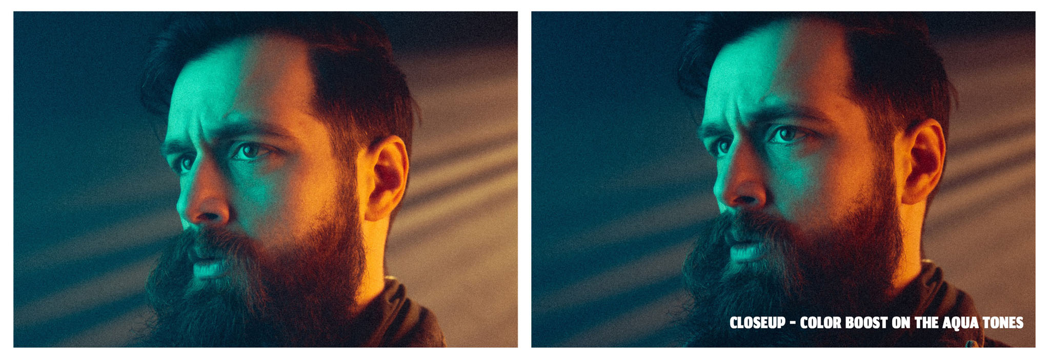
2. Color Booster
(Timestamp: 02:20 in video)
We’ve all been there – you boost the oranges in a sunset, and suddenly skin tones look radioactive. Or you enhance the greens in a landscape, and the whole photo takes on an unnatural hue. I wanted to create a way to make a color pop without oversaturating my photos.
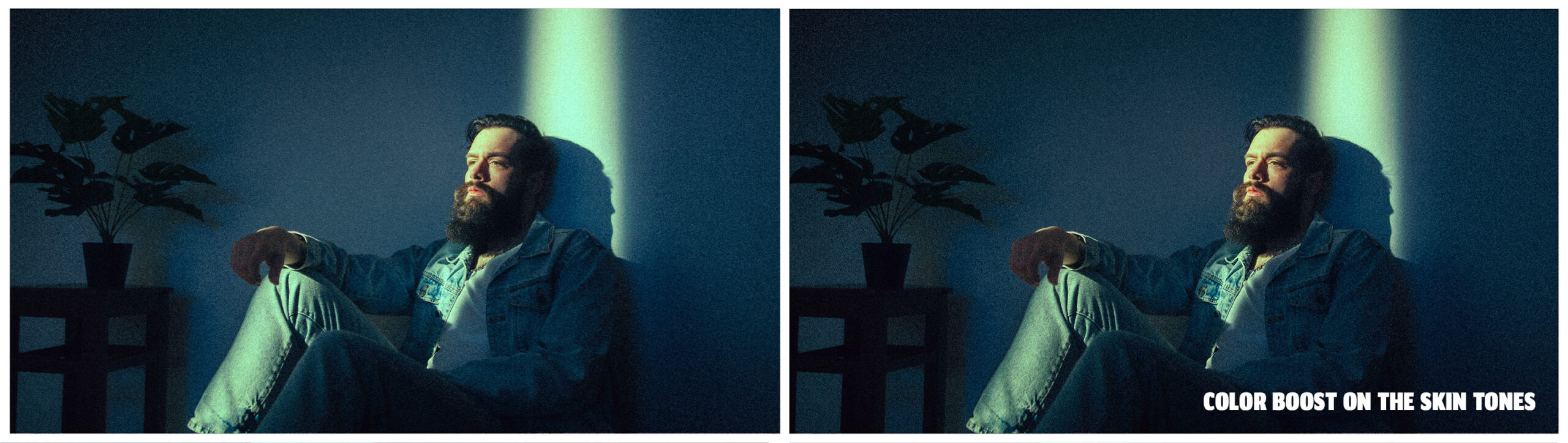
My solution uses Perceived saturation instead of just cranking up the saturation. I call it the Color Booster preset. Instead of using the HSL panel to boost saturation, this tool works more intelligently by darkening surrounding colors while keeping your target hues vibrant. The effect is more natural because it mimics how our eyes perceive color contrast in the real world. Perceived saturation is how vivid a color looks based on its contrast with surrounding colors—dulling or darkening other tones makes an untouched color seem more vibrant. So instead of adding even more saturation to our already saturated images, my tool will reduce the brightness of its surrounding colors. And yes, this will affect the exposure a bit. But we can compensate for that afterwards.
To recreate this in Lightroom, you need a color range mask that is inverted and in which we will use the Exposure and Contrast sliders to knock back the brightness of those other hues just a bit. Save this as a preset. And, afterwards, we can simply apply the preset and pick another hue with the eyedropper of the color range mask. Once you get the hang of tweaking the exposure values, it’s easy—but if you’d rather have it ready to go, you’ll find my Color Booster preset on my store.
3. De-focus
(Timestamp: 05:40 in video)
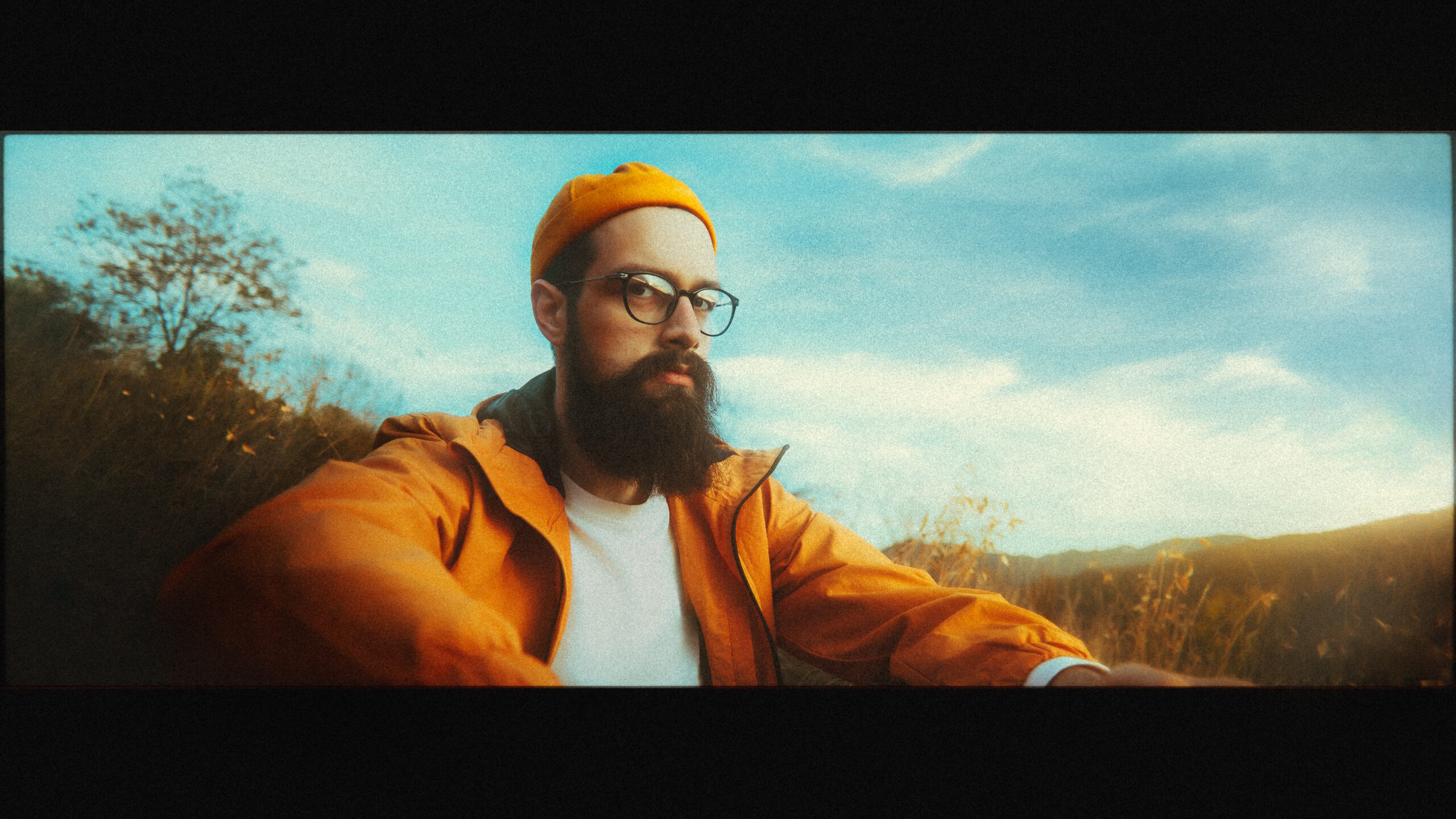
Perhaps the most unexpected tool in my kit is what I call the Defocus preset. At first glance, it seems counterintuitive – why would anyone want to reduce sharpness intentionally? But here’s the thing: modern cameras, especially smartphones, are almost too good at capturing details, and some photos end up looking super unnatural because of that.
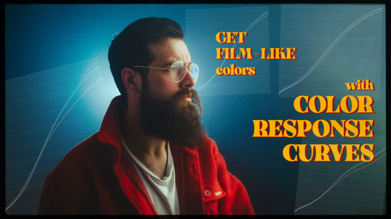
I like to use this tool for a few different things. First of all is the obvious benefit for emulating realistic-looking grain. Because we want the grain particles to be the smallest visible thing in a photo, we need to knock down the amount of details that are visible underneath the grain layer in our digital photos. But if you want to read more about grain, check out my deep dive article here: https://vmoldo.com/grain-in-lightroom/. But let’s go back to the defocusing tool. I also like to use it to give my images a dreamy, softer look and compensate for photos taken on cameras with smaller sensors. They seem to oversharpen details like foliage to compensate for the sensor’s inability to capture details. And BTW, for those of you who read my entire article, I have a bonus. You can use the code CRC25 at checkout, the entire month of May, on my store for 25% off any of my Color Response Curves packs!
The usual sharpness panel inside Lightroom will only let you add sharpness. And if you want to create dreamy fantasy looks, you will use negative texture, clarity, or dehaze. But there is one more way to make a photo softer in Lightroom using masks.
The tool is covering the entire image with a mask that has its sharpness slider set to -100. This way, you can use the preset amount slider after you have applied it to tone it down. But of course, you wouldn’t want -100 sharpening on your images. The key is subtlety. I typically keep the effect between 10-20% strength, enough to improve the image without making it look too soft. Since the mask is set to -100 sharpness, the percentage you choose with the preset amount slider directly controls how much sharpness is reduced. Add a bit of grain on top, and you get a surprisingly film-like result. Because I am doing this inside of Lightroom, it is Non-destructive, Adjustable, and Reversible anytime! I’ve saved this as a reusable preset to speed up my own workflow, and you can grab that version from my store if you want to try it right away or just make your own.

4. Edge Softness
(Timestamp: 08:39 in video)
I bet I’m not the only one who loves those old Soviet lenses with their dreamy contrast falloff, subtle vignetting, and that organic softening toward the edges. Nowadays, that is perceived as an optical flaw, but I think it can add character, especially for cinematic portraits. So I wanted a way to replicate some of that character in my digital photos as well, even when I’m not shooting on a vintage lens.
This tool is a build-up on the previous one. It applies a radial mask that gradually reduces sharpness and clarity as it moves outward from the center of the image. But it doesn’t stop there, and at the same time, I’m adding a natural-looking exposure drop-off, just enough to replicate that classic optical character/vignetting and mixing it with some contrast drop-off as well.
The effect will be subtle; don’t expect it to completely transform your lens. But what I love most is how it softens distractions without sacrificing critical focus on your subject if your subject is towards the middle of the frame. It’s perfect for portraits (where you want creamy backgrounds) or travel shots where harsh digital edges ruin the mood. But I still think this tool needs some refinement, so it’s not yet available on my store.
5. Light Leaks
(Timestamp: 11:38 in video)
I’m also currently experimenting with ways to create light leaks entirely within Lightroom (no Photoshop needed). This is part of my film emulation obsession, and it would be much easier to just use another software for it. Again, I am aiming to replicate some flaws from the past with modern tools so we can get some nostalgic kick out of our photos, and my early tests are promising.
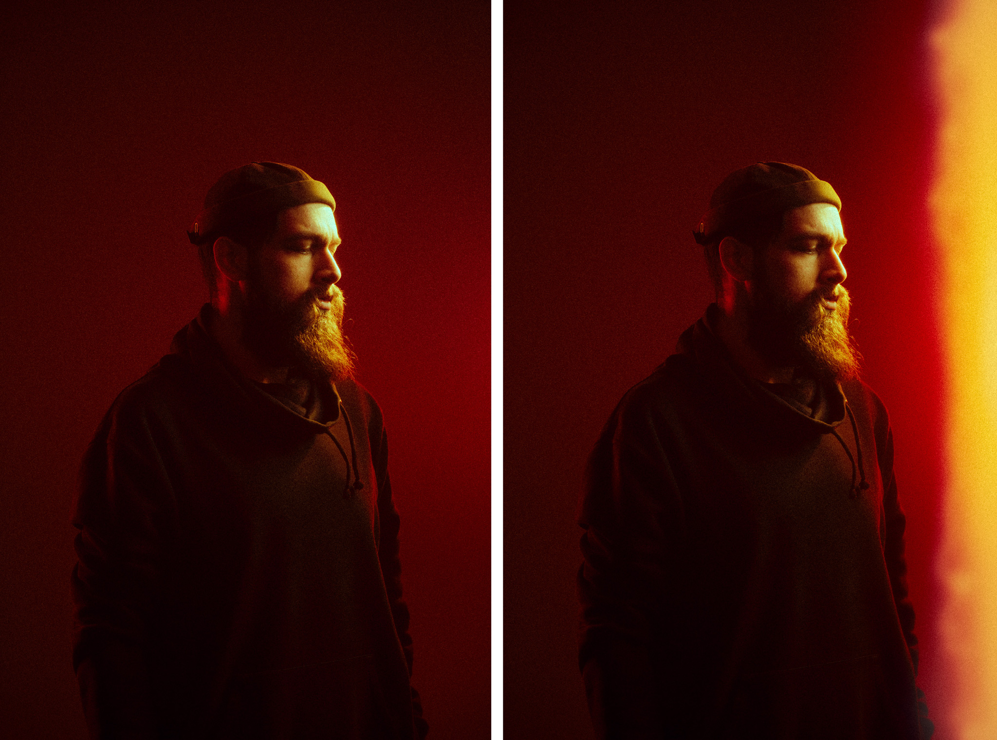
To do this, I’m currently using 2 masks on top of each other. The first one is creating the reddish mist around the light leak using some contrast reduction mixed in with WB adjustments, and a bit of a red overlay. The second one on top is aiming to blow out the area where I want the light leak to be by creating a tone of contrast, so even in those places, some details in the photo remain visible. But creating convincing light leaks purely through Lightroom masks presents three core challenges:
- First, positioning —since presets bake in mask locations, I’ll likely need to build separate presets for different leak positions.
- Second, stackability — users will either need to manually remove each preset or be forced to use only one per photo, and I’m leaning towards the second option here.
- Third, saturation – With the current recipe, I can’t seem to control the saturation of the effect so it would match he overall look of the photo, and right now they seem to look better on vibrant shots.
Conclusion
Looking back, I realize these tools didn’t just change my workflow. They changed how I see and edit my photos. Instead of focusing on how to mix 10 different sliders to get the look that I want, I now focus more on compensating for my composition and exposure, and that, ultimately, is what good editing should be about. My Lightroom tools will not give me a look with one click, but the tools are enabling me to create my looks while spending less time fussing around with multiple software.
What about you? Have you created any custom tools that changed your workflow? I’d love to hear about your experiences – drop me a comment and let’s compare notes!