While discussing grain or film emulation on digital files is fun I think there is one thing we as photographers don’t do enough and that is breaking down a photo in all its aspects, so I’ll start this new series where I’ll do just that so you have a peak into my workflow and how I create
Context
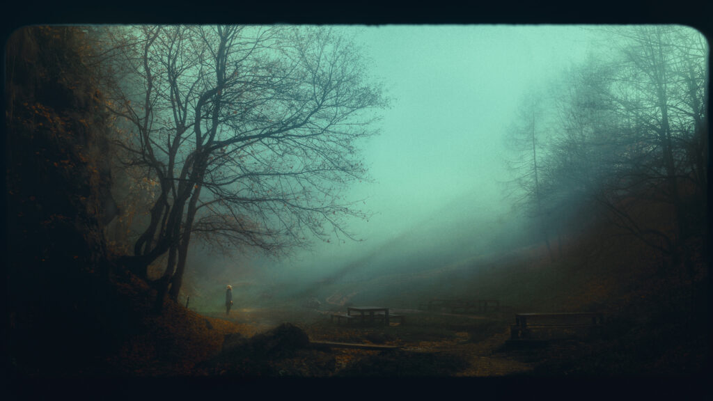
8:00 AM I woke up and saw thick fog outside so I packed some gear, grabbed my long coat and hat, and I rushed into the nearby forest.My aim is to create a few shots that evoke loneliness and depression and for that feeling thick fog is just perfect.
Gear
I know I wanted the image to have a perspective that’s somewhat similar to the natural human field of view so and give the feeling that someone is watching this character so my lens choice was 35mm and 50mm. That along with a mix of filters that are always in my backpack and a tripod helped me keep it light so I can hike easily.
Location
Picking the best location was a matter of hiking until I find the right light. I wanted shots that will either have the character in a sunspot or create silhouettes, and this time it really did take long to find the best one
Composition
Just as I got here, I was shocked by how little fog was present but there were beautiful sun rays and I thought it was worth waiting for some fog wanting to capture the entire scene I picked the 35mm and put my period down low so in the final shot there would be some layering. When possible I try to have a few things in the foreground to have the subject more grounded in the universe I’m trying to create. At the same time, I aim to place my character close to the center of the golden rule spot and easily achievable by aiming for the rule of thirds and having the subject in the lover left line intersection. I do this liberally because I know that ill play around with the aspect ratio anyway in post-production so even if my composition is not perfect in the camera it’s more important to capture the scene as I want it.
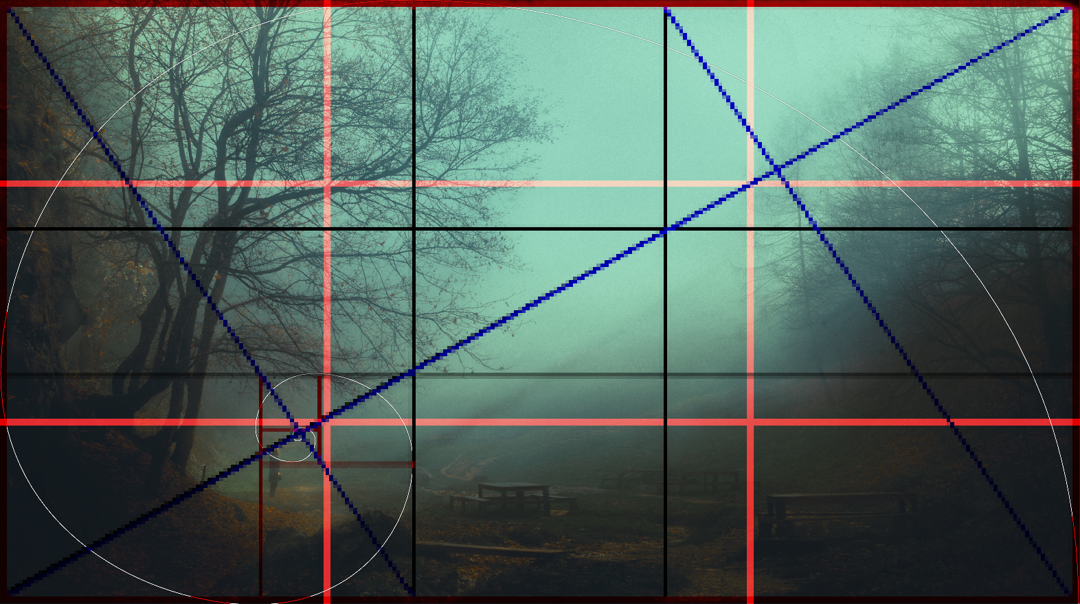
close enough is better than perfect
Exposure
This is fairly basic so ill just glance over it quickly. I was outside and had more light than I needed so ISO 50, f/5 so I can have a bit of space to roam around and still be somewhat in focus a CPL filter to eliminate reflection on the wet vegetation and around -1 EV put me to around 1/320. Fine for this kind of static shot but most of the time I also add a Variable ND filter as well so I can capture some motion blur in my shots
Post-processing
The first order of business is to get rid of the adobe color profile set it to camera flat and lower the contrast and set a good neutral white balance and recover some details from the highlights because I want more contrast in the branches of the surrounding trees. This leaves me with a very flat image that looks similar to the Log form for the video. Now that I have all the details needed, the curves panel is the tool of choice for reintroducing contrast and in conjecture, with a few masks, I can darken the foreground, add contrast back into the image and crush the whites. I do all this with a hefty amount of grain from lightroom applied that I will remove before going into photoshop to have a good reference for the next step
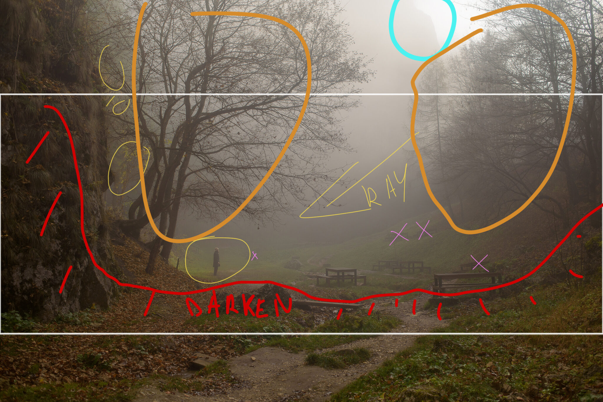
Next, I’ll go into photoshop, transform my aspect ratio with a bit of content-aware scale, remove the distraction (purple) and add the sun rays that I captured before into this shot. Also at this point, I’ll add the film gate and the grain, and degrade the sharpness to make the grain more realistic. I’m aiming for a 16mm film look today
When this is done I’ll take the image back into lightroom for the final color grade. This is an essential part of creating cinematic photos that evokes emotion. In this piece, I used a cold color palette because I was aiming to emphasize the contrast between the vastness of the scene and the size of the subject and to evoke loneliness and despair. The sun rays also help guide the viewer’s eye toward the subject and is the only spot in the entire shot where I added warmer tones that aims to add a bit of hope for our character and creates visual interest by color contrast. All this is achieved with a mix of curves and HSL while the color-grade wheels are there mainly to provide a blueish overlay in the shadows and cyan highlights.
In curves, I like to add a bit of color contrast by adding a slight S on all the channels, and in HSL I made sure that the cold colors are the ones with significantly more saturation and enhanced the luminance of the fog a bit.
As a final step, I used a technique learned from a movie colorist to turn the image from RGB into HSV and increased the saturation globally without affecting the brightness and that was just the cherry on top
If you want to further chat about this topic feel free to reach out over any of my social media channels and if you think you learned something from this post consider buying me a coffee using the button below.
