When it comes to art, there are a million and one decisions to be made. What aspect ratio would better fit the story you are trying to tell? What colors should you use? What aspect ratio should your masterpiece be? For the artistically minded person, these constant choices can be daunting. In this blog post, I am breaking down one of my recent images and explaining the decisions I took while making it. Some of them are taken instinctively, others on the spot but they are what makes or breaks an image – decisions, decisions, decisions.

Context
Early morning, thick fog all around. My goal: take shots that rely on the silhouette for contrast and composition and on the fog to give a dark vibe, creating uncertainty and the sensation of being lost in limbo.
Gear
Considering my aim was silhouettes and in order to maximize the intensity of the fog, an executive decision was made to go for the longest focal length available on the shelf an 80-200mm Nikon lens. Adding a DIY haze filter on top of it to cut down the sharpness of an already vintage lens and a CPL filter for the off-chance that there will be shiny wet leaves or asphalt. Tiny white reflections would only give me something to clone stamp after and I wanted none of that. And since the plan was to use a telephoto lens, it was clear that phone remote control over WI-FI or IR remotes will get the job done. So another key element for this was using a radio remote trigger to shoot. I am using dirt-cheap speedlight triggers and they work just fine to trigger the camera as well.
Location
Now considering the mood and outfit it would have been great to be able to shoot in the old part of the town but living in a car-infested city made that impossible, so heading for some long pathways on the outskirts of the forest was the next best thing. The fact that it was late autumn and most of the trees had already lost their leaves helped me greatly with a more sinister vibe and finding a spot was just a matter of looking for somewhere where I could pose around 30 meters (100ft) away from the camera and have no tree be directly behind me in order to get that clear space above me.
Composition
I already had gaffer tape on my LCD to help me think in a wide landscape view. Storytelling and cinema go hand in hand, and 2.39:1 is one of the most effective aspect ratios for that purpose. It gives you more negative space to work with, which in the past, I found makes it much easier to craft a compelling narrative.
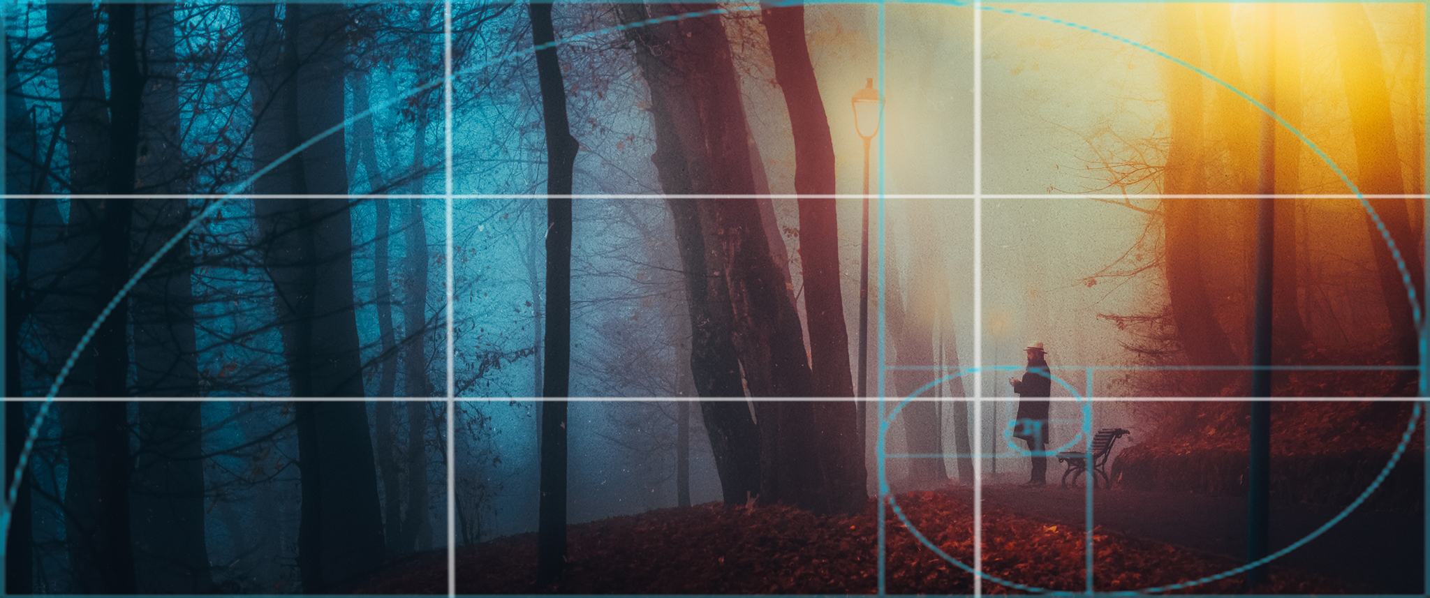
Now if you want to fit the shot into a classical composition rule we can pretend the subject is around the lower third intersection or that I was aiming for the golden spiral, but the real aim here was to have a pattern of vertical lines that go all across the photo from top to bottom and the subject to be the one thing breaking that pattern. This will create a feeling that the subject does not belong there and is standing out a fact that will direct the viewer’s eye toward it while at the same time leaving a lot of space in front of the subject to create breathing room and the feeling that he is starting into the abyss and the focal length of 100mm gave me the perfect perspective for that, it is long enough to accentuate the fog and wide enough to allow for negative space.
Exposure
There were two things that were needed here. At least 1/focal length so I won’t be getting any motion blur, even tho the camera was on a tripod the whole time and a fairly wide sharp zone to pace around without getting out of focus. My method when shooting stuff is to prefocus around the area where I’ll be posing and switch the camera to manual focus so there is no chance for it to focus hunt and decide some out-of-focus bokeh was sharp enough for it to lock onto that. So I ended up on 1/500sec at f/4.5, ISO 200.
Post-processing
The first thing as always was to take the shot to a neutral starting point lowering the contrast and setting the color profile to “camera flat”, increasing the level of details by raising the shadows a bit and fixing the white balance. This highlighted 3 things, there was a lot of color contrast between the orange leaves and the blue cold tone of the fog, the sunlight didn’t reach far enough to expose the right side of the shot that well and the light poles were sticking out in a horrible way against the randomness of the tree trunks. This inspired me to go in with finely tuned local adjustments to simulate the lights being turned on and create a more evenly lit scene where the light fades from top to bottom and further down the line this will also motivate a duo-tone approach on the classic blue-orange color grade.
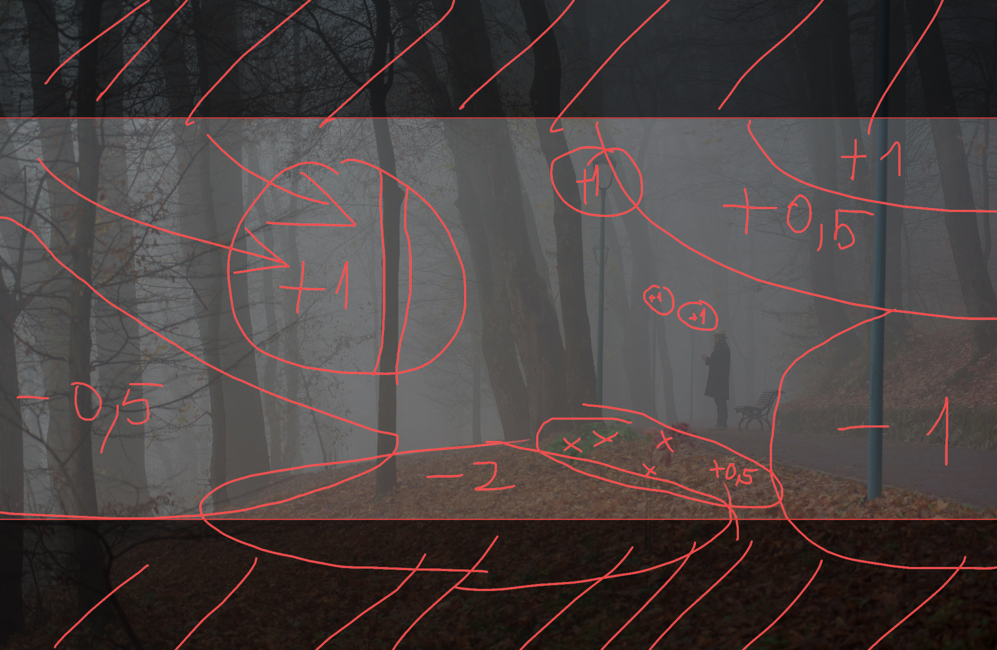
After creating the artificial light in the scene, my focus moved to color, also using the local adjustments I added slight color overlays and tweaked the WB to be blue-cyan on the left side and more orange near the subject keeping in mind that halogen light also has a bit of a magenta cast to it. In order to bring back the contrast, I like to do this using the curve tool as it offers the possibility to do it with a lot more control than the 4 zone sliders. I crushed the highlights and lowered the exposure of the entire scene while making sure the tree branches don’t go into the pure black territory. While in the color side of the curve tool I created custom subtle S curves to infuse the image with more chromatic contrast. In HSL all the greens were shifted towards yellow tones and all the purples to blues so there will be fewer hues in the final image and off it goes to PS.
Here I adjusted the aspect ratio, removed the plant in the foreground and other distractions, enhanced the details on the newly created leaves, and added a bit of grain and a bit more haze to the scene by duplicating the layer, blurring it, and overlaying it with very low opacity. Here I also added flare to the lamp post to make them look more believable. And the most important part was increasing the saturation using the HSV method that I recently from film colorists. This allows me to add saturation without rising the brightness of the entire shot
Now back to lightroom for the final grade. I pumped some reds into the shadows to warm up the image some more and some cyan into the bright highlights, did quite a lot more local exposure masks to add sharpness to the subject area and haze in the forest while also adding 2 more blobs of light to balance out the image using the trees in the middle as a divider.
The final image ended up with an aesthetic that is strongly inspired by concept art posters. This provides a fantasy-story look where our character seems lost but we know that everything will be ok in the end due to the warm colors. I love the result but I’d also like to note that with a different editing approach, this image could easily be transformed into a completely different mood with a more realistic horror-thriller vibe and that is something I might want to try in the future.