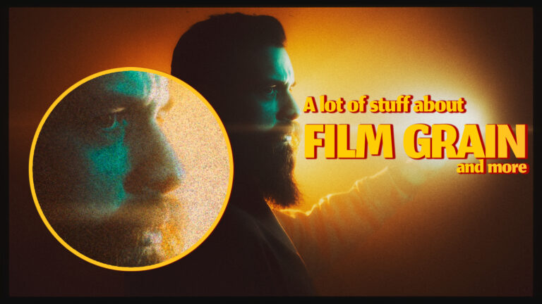
It has been a bit over a year since my first article about film grain. And I thought that that was it and that I’d dug more in-depth than most people are willing to do when adding film grain to their digital files but despite my best efforts, here I am again. One more article about grain and I hope this will be a more comprehensive guide and a perfect snapshot of grain emulation in early 2024
Quick Recap
First of all, I want to say that I think it is completely hilarious that the original article got so popular that if you Google “film grain emulation” you get to see my face. And even though I strongly encourage you to read the first one and get all the details out of it, here are the main ideas so you can have a better understanding of what I am going to say afterward.
“On film, the images are composed of grain. The particles are organic in shape and are distributed unevenly in an emulsion and when exposed to light they create the image you finally see.”
Film images are made out of organic particles (silver halides) that are unevenly distributed in an emulsion layer. Those particles are what retain the images on film. When developing the film we can make them more or less apparent but keep in mind that the chemical process will wash them away in the darker parts of the photo. So what does this mean for film grain emulation?
- Those particles are the smallest detail in a photo so they should be the smallest detail that one should be able to distinguish
- The size of the grain particle should determine the sharpness of any line in the image since the entire image is made out of silver halides.
- The amount of film grain should not be the same across the entire image. It should be more apparent in mid-tones and highlights than in shadows because we are washing away more of the silver halides when developing negative.
- The distribution of grain particles across the image should look like a thin layer of sand on top of a piece of paper. So when looking for grain overlays you should see randomly arranged tiny particles and not a grid of squares
- Noise and Grain are 2 very distinct things. Noise is digital and it is a grid of squares while film grain is organic so the particle shapes and position are randomized and should look like something created by nature
- Photos will not look like film just because you added grain, it has to be part of an entire film emulation workflow.
Let’s go deeper down the grain emulation rabbit hole
First of all ask yourself: What am I trying to emulate?
Is it a film photo printed on a piece of photographic paper? Is it the look of a still from a movie that was shot on film and then printed on another type of film so it can be projected in the cinema? Or is it just the look of film photos that were developed in a lab and digitally scanned afterward? Knowing what you are going for will have a huge impact on the decisions that you are going to make while editing.
Because I am generally more interested in cinema-like images, I skipped over the grain of the paper in my last article. But if we are going for the look of printed film photography, there are 2 types of grain: the grain of the film and the grain of the paper or texture. To emulate that appearance, it is necessary to simulate both elements. So an additional layer of grain that is uniform in size and distribution will be needed since we have to simulate the look of the paper as well. Keep this in mind especially if you like to add white borders to your photos. If they are supposed to look like paper, they won’t be perfectly white and will have some paper texture/grain.
While it’s an extra step, this should be a relatively straightforward fix in Photoshop or Lightroom. And if you want to play some more you can even photograph sheets of sandpaper in diffuse light and have a go processing them, so you can use them as your paper grain overlays. But the important takeaway here is that sometimes you might want to add more than one layer of grain to your images.
Now let’s go back to the film grain. Individual grain particles should be roughly the same size over the entire image. At first, when Adobe Lightroom introduced the ability to add Grain with masks I was confused about why they made the size and roughness sliders as global adjustments. But it makes a lot of sense. Since we are trying to emulate an emulsion with particles, even though particles are more prevalent in certain areas of the photo the size of the particles should be the same across the entire frame as they are all made by the same process.
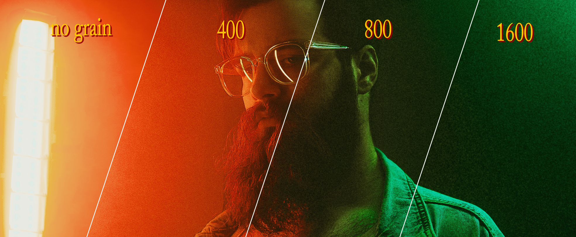
The size of the grain should increase proportionally with the ISO of the film that we are trying to emulate. If you want your grain to look more authentic you should probably use bigger grain in darker situations and smaller grain size in photos where you do have a lot of light coming into the camera. If you are adding fine grain ask yourself: Could I have gotten this shot with very low ISO? So use common sense when it comes to the exposure triangle in your shot and scale your grain accordingly
Fun fact about film the higher the pH of the developer solution the more visible the grain particles are in the final photo
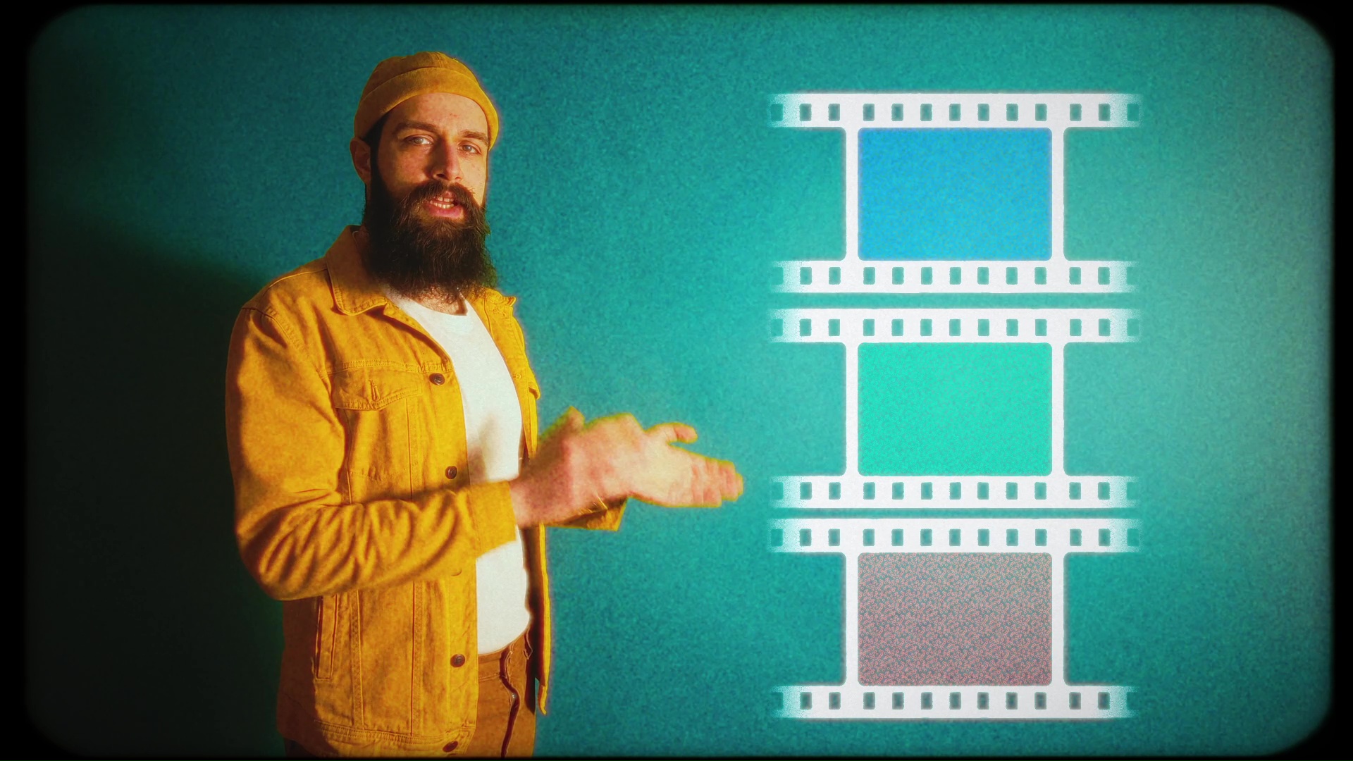
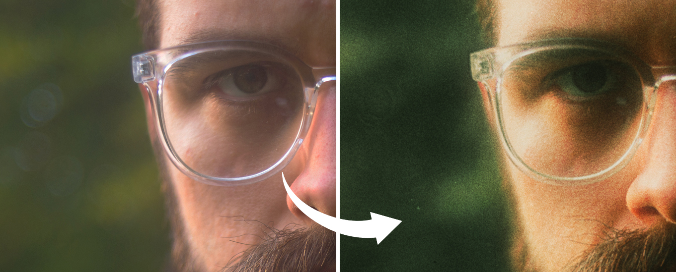
Now let’s take a closer look at the layers of color film. The color film has 3 layers of silver halides, each one of them mixed with dyes to get the Red, Green, and Blue layers. All this is happening at a microscopic level but it has a huge impact on how grain should look in color photos.
Grain in color photos should not be black and white. It should be a mix of random colored speckles. Random because when scanning film the light passes through the 3 layers one by one and the results are random hues obtained by mixing the red, green, and blue layers. Colored grain is a detail that most grain emulation solutions that are available to us digital photographers don’t even take into consideration. This makes adding colored grain one of the final steps in the evolution of hipsters who add grain to their digital photos.
An interesting side effect of adding colored grain is the increase in file size. One of the ways we reduce the file size of digital files is by compressing the areas of the photo that have very similar color values. When we introduce grain to a photo we alter the luminance values of neighboring pixels so the compression algorithm has a harder time reducing the file size and if the grain also has color to it, we will be introducing some hue variation and this will make the final file size even bigger.
How colored grain will affect how our grainy photos are compressed and stored on social media is a mystery that I’ll probably investigate in the future. It might be a way to trick platforms into believing that our photos have more details that need to be preserved or it might make them compress them more and have the opposite effect.
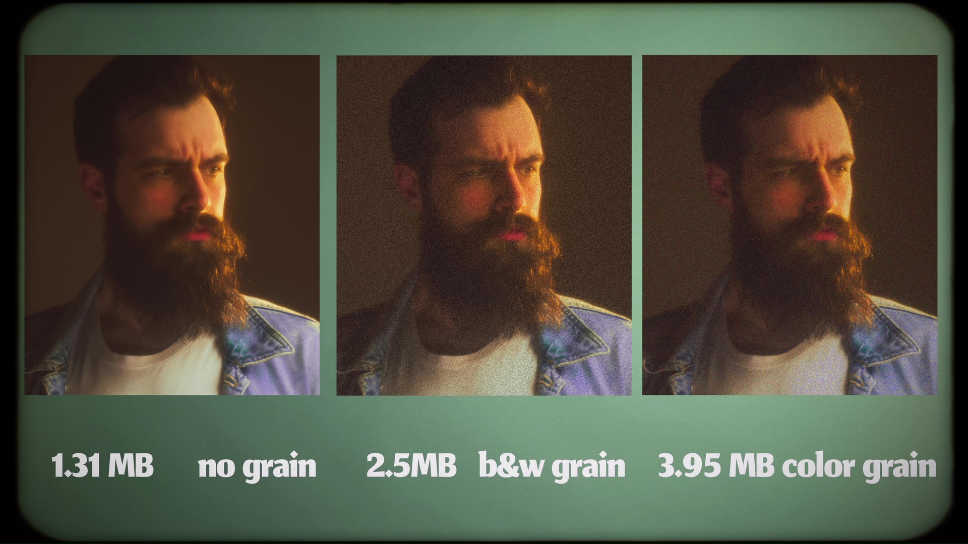
For now, remember that with great grain there comes greater file sizes.
How to get the most realistic grain possible on your photos
I already talked about the methods in the first article but I want to do a quick update with all the new findings I have about grain.
First of all, the fact that we can now add grain based on luminosity masks inside Lightroom is huge. This means you can finally have control over how much grain you have in your image based on highlights, mid-tones, and shadows. Or you even split your images into more sections for that matter and have even finer control. My biggest complaint is that Lightroom still has no way to add any kind of color to the grain but I still hope that they might read my articles and add a chroma slider soon. And even though Lightroom is missing such an important part of the grain this is my favorite way to get some grain on my shots fast. And have some grain present while working on color and other aspects of my photos. It might not be the most accurate but it’s fast and easy, especially with my One-click Grain presets that will give me my luminosity marks and add grain based on the luminosity values of the shot while also lifting the blacks and reducing the overall sharpness of the image. And you can get them as well following the link: https://vmoldo.gumroad.com/l/grain
Photoshop as the king of photo manipulation apps still has no direct way to add grain and this is a shame in my opinion. One of the best ways to get good grain in PS is still to use scans of blank film shots and use them as overlays with Hard Light blending mode and custom masks that are generated based on your image and combine that with decreasing the sharpness of your image so you won’t have details that are finer than the grain you previously added. This is at least unpleasant to do for every single image but might be the option that offers the most control at the end of the day. 9/10 times I don’t feel like going through all of this so I will only go to PS for retouching and add the grain in other software.
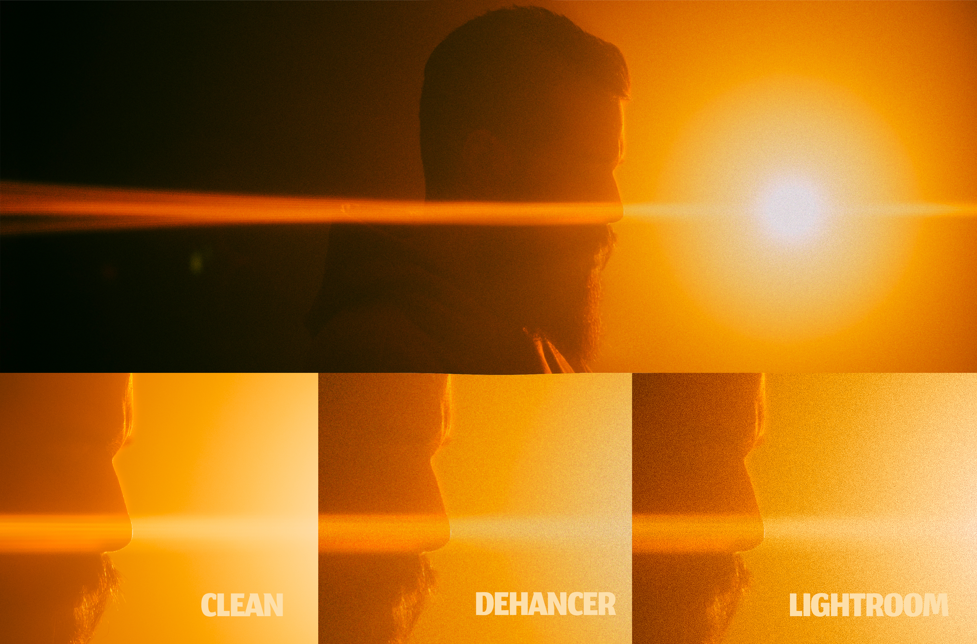
A much better alternative for grain is to use the Dehancer plugin for LR/ PS. Their way of imposing your image on grain generated based on the luminance value of your image will produce quite amazing results. This is why Dehancer is my go-to option when I want the best grain and all the other film emulation tools are amazing compared to how much effort it would take to get these results in Photoshop. The one thing that I don’t like about Dehancer is that it bakes everything into the image and you can’t tweak your setting 5 minutes later when you realize you exaggerated with the amount of grain you added.
Extra nostalgia factor
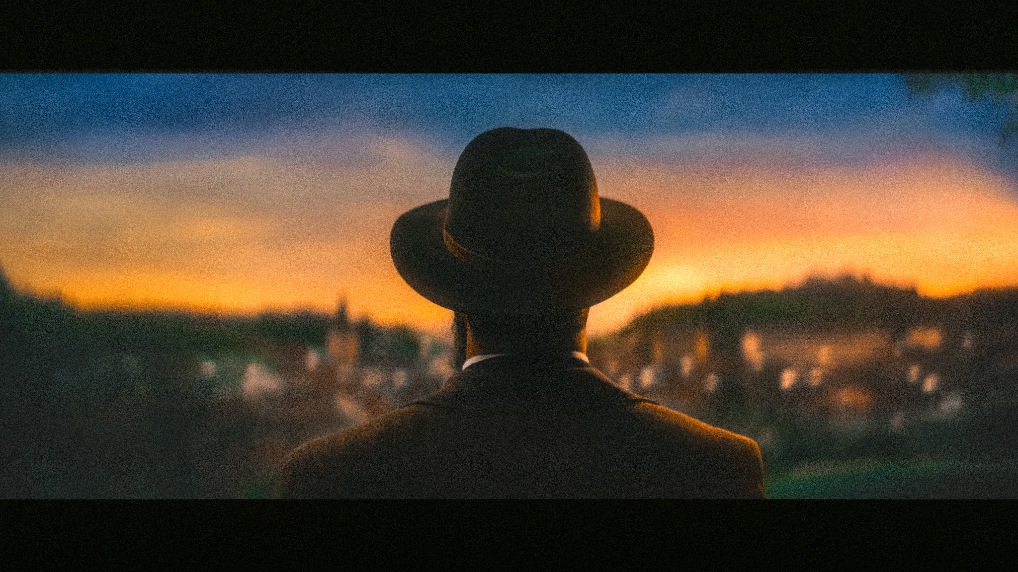
In closing, don’t just throw random grain on your photos! Aim for a cohesive film emulation look that complements your image. This creates a more realistic aesthetic, avoiding the impression of simply cranking up the ISO. Instead, mix it up, and add bloom, halation, film damage, dust, or even water damage to your photos for extra nostalgia. If you like the analog look is all about imperfections so break a few rules since you already started lowering the quality of your photos on purpose. All this while making sure to mix it with the right color grade.
Secondly, consider where the photo will be displayed. Large prints benefit from toned-down grain, while social media posts might need bolder grain to be noticeable on small phone screens.
Finally, the “best” tool depends on your needs. Lightroom offers efficient batch editing with monochrome grain, while Photoshop or the Dehancer plugins provide the most visually pleasing options. Experiment, have fun, and choose the approach that best suits your workflow and creative vision!