I was trying to test my wireless controller and find its limitations so I went out looking for some more moody dark shots but was a challenge for my editing skills that made me learn something new and evolve as an artist.
Context
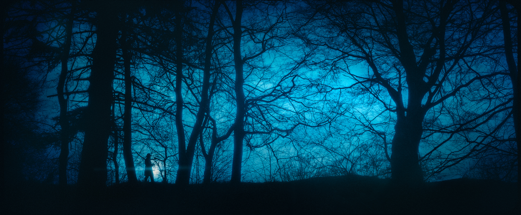
My goal with this piece was to have a dark atmosphere where the character can look lost and in search of something while being surrounded by the darkness and mystery of the forest. I was inspired by the look of the trees in winter which reminded me of some illustrations from children’s books where a forest is always a dark place full of danger so my goal was to recreate that feeling with a cinematic look.
Gear
After trying different focal lengths I settled on 50mm as it had a nice balance between being wide enough o capture big trees and not distorting the perspective. And also I need a long enough lens to be able to see from down a hillside. As I am a glorified selfie taker the camera was on a tripod I was controlling it with my 10$ router through the phone app. Inside the lantern, there is a Godox Cube light that is magnetically attached and the lantern has its glass panels frosted with hair spray for extra diffusion. I also tried to shoot this with diffusion filters but ultimately decided against it so I would have sharper shapes to work with
Composition
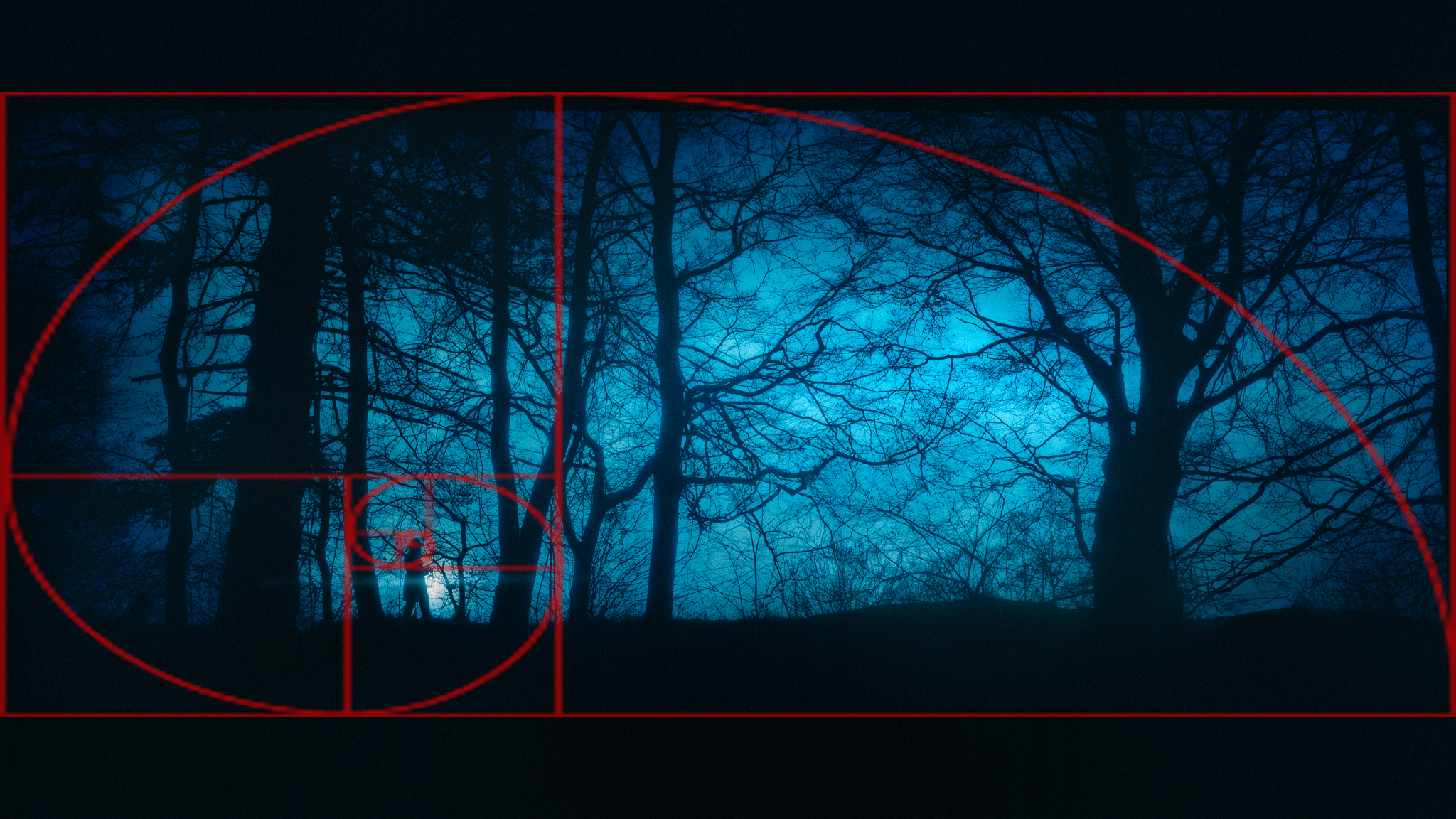
I wanted the character to have a lot of space in front of him to give him some space to walk towards but also placed him in such a manner that the trees can create a trap to accentuate the emotion of loneliness and place some challenges in the way. I am still shooting in a wide aspect ratio for a cinematic look so this was not a problem but I aimed to have the lantern close to the middle of the Fibonacci spiral since I already knew it would be the brightest spot in the image so the viewer’s eye would start exploring the shot from it.
Exposure
To get a nicely shaped silhouette I stepped down my aperture to f8 and underexposed quite a bit since already knew I didn’t want many details in the shadows and was concerned about not blowing out the sky. I also aimed to shoot this on an overcast evening. So the general direction of the light would be against the camera while the exposure difference was not huge and the clouds would provide some texture in the sky. Final settings Nikon D750, 50mm,1/160s | f8 |iso 160
Post-processing
I have edited this one 2 times from scratch. The first one was a total failure and I’ll talk about my mistakes so others can learn.
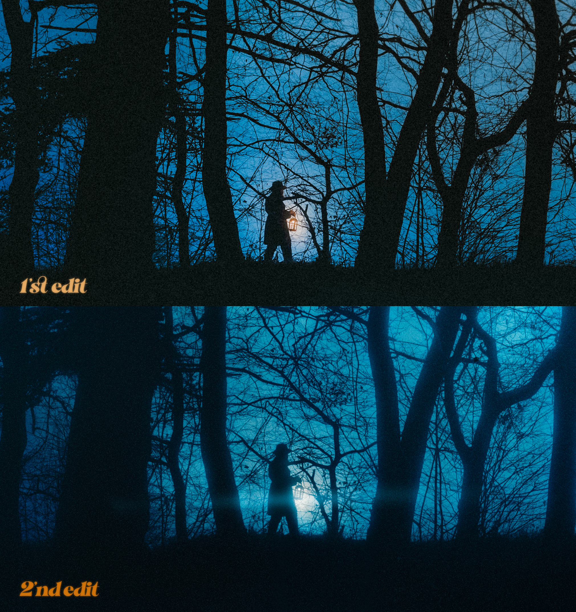
The first steps were the same in both edits. I first try to bring the shot to a neutral point and color-correct it. That means a Neutral color profile instead of Adobe Color, lower highlights, precise neutral white balance, and using masks to correct the light in the entire scene. For this shot, I used masks to correct that blueish cloud in the lower part and bring the entire shot to a more neutral color. I also used masks to create the vignette so the shot looks more like the sun is at a very low point in the sky.
Firstly I tried introducing the cold blue tones with the color wheels and some tonal contrast using the curves ( fine S curve in all channels) and using masks I tried to manipulate the color of the lantern using white balance and color overlays. The atmosphere was not that bad but the highlights were sliding into muddy greens, and the way I approached the masking stage by using luminance-based masks created more and more fringing and all this accentuated the noise and how busy the image looked while also making it look more like an illustration instead of my desired cinematic photography look. So I took a day off and decided to try again with fresh eyes.
The second time trying to edit the photo my brain managed to recall a video I saw quite a while ago on YouTube. Here Jeremy Vickery explains how he uses desaturated versions of colors to trick the brain towards other hues because of color relativity. He talks about the fact that our eyes adapt to colors fast, like a camera on auto white balance, and how we can wrongly perceive desaturated tones of color as completely different hues and how artists can use this in order to give the viewer the impression he is looking at another color when he is looking mostly at tones of the same color. I won’t try to explain this better than Jermey does in his video but instead, I will just put the vid here mentioning that the demonstration at 8:05 is mind-blowing.
Now going back to my photo and how I applied painting theory to my photography. Instead of using luminosity-based masking or the color wheels, I focused on radial gradients and masks made with a brush. This allowed me to have a more organic look and achieve a better atmosphere giving the shot a mysterious forest glow. Instead of manipulating the colors with the curves or HSL I just washed the entire image with a blue-ish white balance mask and started using local adjustments to desaturate and hue-shifted specific areas like the light source in the lantern. This resulted in much more natural transitions, no more fringing, and a more pleasant overall look. The method is a bit different than the usual photography color grading tools and it took a bit to get used to, but it is absolutely worthed for this kind of shot. One more useful tip when working with images that lean a lot into a specific color is to take frequent breaks because your eyes will adapt to the image and you won’t see your mistakes as well after staring at it for 10-15 minutes.
For the finishing touches, I added some black border to force the wide crop into a 16:9 aspect ratio for the socials, an anamorphic flare to the lantern, and used one of Ddehancer’s film emulations to add a bit more bloom to the image. Finally, I nudged the blue tones exactly where I wanted them.